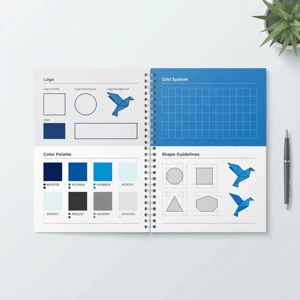
The Angry Birds graphic guidelines 2011 document is one of the most quietly influential brand books of the mobile gaming era. Released while Rovio was scaling a single puzzle game into a global merchandising machine, it gave licensees, printers and agencies a single source of truth for how the characters could be drawn, colored and placed.
If you have ever wondered why Angry Birds plush toys, cereal boxes, birthday party plates and t-shirts from completely different manufacturers still looked like they came from the same universe, this is the reason. Consistency was engineered, not accidental.
In this guide we break down what the 2011 guidelines actually contained, who used them, and what modern brand and product teams can still learn from them today.
What Is the Angry Birds Graphic Guidelines 2011 Document?
The Angry Birds graphic guidelines 2011 was a licensee-facing style guide published by Rovio Entertainment. It was not a marketing brochure. It was a working manual that told partners exactly how to reproduce characters, logos, backgrounds and secondary art assets across print, packaging, apparel and digital media.
Documents like this usually pair approved artwork files with strict usage rules. A brand style guide exists to remove guesswork, so a factory in one country and a print shop in another produce visually identical results without ever speaking to each other.
The 2011 edition matters historically because it captured the franchise at its visual peak: the original slingshot logo lockup, the classic five-bird cast, and the flat, saturated cartoon look before later films and reboots restyled everything.
Who Needs and Who Used These Guidelines?
Style guides are written for the people who touch the artwork, not for fans. In practice, the Angry Birds guidelines circulated among a fairly specific set of professionals.
- Licensed merchandise manufacturers producing toys, stationery and apparel
- Packaging designers who had to fit characters onto boxes, bags and blister packs
- Print vendors matching brand colors across paper, plastic and fabric
- Advertising and social agencies building campaign creative
- Brand managers reviewing and approving submitted artwork
Today the same document is studied by graphic design students and brand strategists as a case study. Anyone assembling a modern identity system can borrow its structure, and teams that need help executing that work often lean on professional character and franchise design resources to keep assets organized.
Key Features of the 2011 Guidelines
Character Model Sheets
Each bird and pig came with approved poses, expressions and turnarounds. Licensees could not redraw a character freehand; they selected from a locked library. This preserved silhouette accuracy, which is the single most recognizable part of the Angry Birds look.
Logo Lockups and Clear Space
The wordmark had defined minimum sizes, mandatory clear space, and approved horizontal and stacked versions. Stretching, recoloring, outlining or adding drop shadows to the logo was prohibited. These rules protect legibility at thumbnail size, which mattered enormously on app store icons.
Color System
The palette was specified in CMYK, Pantone and RGB values so the red of the lead bird stayed the same red on a screen, a shirt and a cardboard box. Secondary and background colors were separated from character colors to prevent muddy compositions.
Typography and Secondary Elements
Approved display and body typefaces, along with patterns, slingshot motifs and environmental props, gave designers a kit of parts. That kit meant new layouts could be produced quickly without inventing new visual language each time.
How to Read and Apply a Guideline Document Like This
Whether you are studying the Angry Birds graphic guidelines 2011 or building your own, the workflow is similar. Approach it as a checklist rather than a reference you skim once.
- Read the do-and-do-not section first, because it defines your hard boundaries.
- Download only the approved vector and raster asset packs, never screenshots or fan art.
- Confirm the color mode for your output medium before you start designing.
- Build your layout with the specified clear space measured, not eyeballed.
- Check minimum size rules against your smallest real-world application.
- Submit a proof for brand approval and archive the approved version.
That last step is often skipped and it causes the most rework. Version control on approved artwork saves weeks across a product line.
Benefits of a Strong Graphic Guideline System
The commercial value of a document like this is easy to underestimate. It is not about restricting creativity; it is about protecting recognition.
- Instant recognition across dozens of unrelated product categories
- Faster approvals because partners already know the rules
- Lower production costs from fewer rejected proofs and reprints
- Legal clarity on what licensees may and may not modify
- Long-term brand equity that survives staff turnover at every partner
Potential Challenges
Even a well-written guideline set runs into friction. Rovio managed an enormous licensing program, and scale creates predictable problems.
- Outdated PDFs circulating after the official assets have been revised
- Color drift on unusual substrates like matte plastic or knit fabric
- Regional partners improvising when a required pose is missing
- Tension between strict rules and genuinely creative campaign ideas
Best Practices and Tips
If you are building or maintaining a guideline document in 2026, the fundamentals have not changed much. The delivery method has.
- Host assets in a live, versioned library instead of emailing a PDF
- Show wrong examples next to right ones, because visuals beat paragraphs
- Include real production photos, not just idealized mockups
- Date every revision and retire old files properly
Real-World Example
Imagine a stationery brand licensed to produce Angry Birds notebooks. Without a guideline document, its designer would trace a character from a game screenshot, pick an approximate red, and stretch the logo to fill the cover. The result would look almost right, which is worse than clearly wrong.
With the 2011 guidelines in hand, the same designer pulls an approved vector pose, matches the Pantone red, applies the correct clear space, and passes brand review on the first submission. One document turned a three-round approval cycle into one. Teams that document their own character assets the same way, as covered in this detailed look at Angry Birds franchise artwork, see the same efficiency gains.
Why It Matters
The Angry Birds graphic guidelines 2011 marked the moment a mobile game became a licensed property with real discipline behind it. That discipline is why the brand extended into films, theme parks and thousands of products without dissolving into visual noise.
For designers and founders today, the lesson is simple. Write the rules down early, distribute them properly, and enforce them kindly. Recognition compounds.
Frequently Asked Questions
What did the Angry Birds graphic guidelines 2011 include?
It included approved character model sheets, logo lockups with clear space rules, a specified color palette in Pantone, CMYK and RGB, typography choices, background elements and a list of prohibited modifications.
Was the document public?
It was produced for licensees and partners rather than the general public, though copies have circulated widely online and are now commonly referenced in design education.
Can I use those assets in my own project?
No. The artwork remains the intellectual property of the rights holder. Study the structure and methodology, but create your own characters and assets for commercial work.
Are the 2011 guidelines still accurate?
Not for current products. The franchise art style was refreshed for later games and films, so any live licensing work needs the newest official guideline package.
Conclusion
The Angry Birds graphic guidelines 2011 remain a masterclass in turning a simple cartoon cast into a globally consistent brand system. Clear character rules, a locked palette and disciplined logo usage did more for the franchise than any single marketing campaign.
If you are documenting a brand of your own, start with the essentials and grow the document as you scale. For deeper reading on how this franchise handled its artwork, take a look at this related Angry Birds breakdown.